G180
Break the Limit.
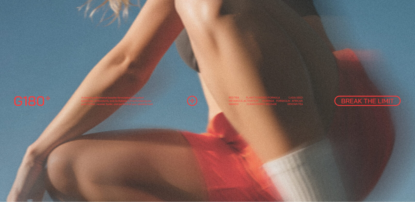
A complete brand and content system for G180, a plant-powered performance supplement built around energy, endurance and metabolic performance. With only a basic logo to begin with, the project transformed G180 into a bold, high-performance visual universe built for launch across digital and print.
Brand & Strategy · Creative & Production · Growth & Performance
The Challenge
Launching With More Than Just a Logo
G180 came to the project with a product, a basic logo and a six-week window to prepare for market launch.
The ambition was bigger than creating a visual identity. G180 needed a complete brand universe capable of communicating energy, endurance, movement and performance while remaining accessible to both serious athletes and people who train as part of an active lifestyle.
The challenge was to build that system quickly, giving the brand enough visual strength and flexibility to perform across launch content and physical materials.
- Establish a complete visual identity from a minimal starting point
- Make the brand feel energetic, athletic and performance-driven
- Create a visual language that could speak to both athletes and everyday fitness users
- Develop launch-ready assets within a compressed six-week timeline
The Strategy
Build the Brand Around Performance
The strategy began by defining what G180 needed to represent: movement, dynamism, power and disciplined performance.
Rather than pushing the identity toward an overly technical sports aesthetic, the direction balanced athletic intensity with a clean, accessible visual system.
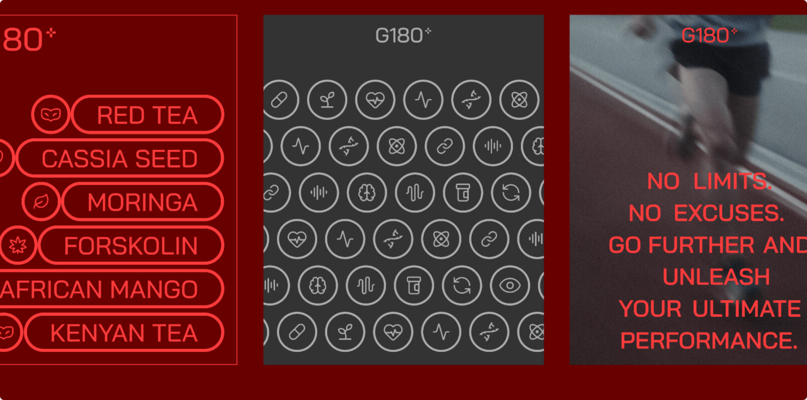
The brand expression was built around a structured typography system using Bai Jamjuree and Outfit, paired with a palette of dark burgundy, bright red, charcoal and neutral greys. Together, these elements created a visual language designed to feel precise, powerful and contemporary.
The strategic foundation became:
Execution
From Brand Foundation to Launch-Ready Content
The work moved from identity development into a complete visual content system, with AI-assisted image generation becoming an important part of the production workflow.
-
Built the brand expression
Developed the typography, colour palette and visual language that transformed the basic starting identity into a cohesive G180 brand system.
-
Developed the photographic direction
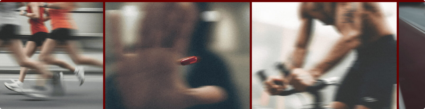
Created high-energy athletic imagery focused on movement, intensity, speed and natural human performance.
-
Introduced AI-assisted art direction
Detailed prompts were used to explore and generate athletic scenes with control over camera position, lighting, movement, composition and photographic character.
-
Refined the generated imagery
AI outputs were manually refined in Photoshop, adjusting lighting, grain, motion and composition to bring the imagery closer to the intended art direction.
-
Created product-focused content
Developed visual assets communicating G180's plant-powered formula and key ingredients, including red tea, cassia seed, moringa, forskolin, African mango and Kenyan tea.
-
Built launch resources
Extended the identity into branded content and supporting resources designed to give the product a consistent presence across digital and offline communication.
The Impact, Quantified
A Launch System That Moved the Numbers
The new visual direction was taken into launch content and evaluated through early audience response.
The project reported:
| 3× | Longer average view time on launch content |
|---|---|
| 180% | Increase in engagement during the first 4 weeks |
| 6 WEEKS | From initial brief to project wrap-up |
Beyond the numbers, the launch validated the visual direction across the intended audience, with the project reporting stronger engagement and increased intent to explore the product.
It also demonstrated that an AI-assisted production workflow, combined with human art direction and refinement, could deliver a polished, high-impact visual system within a compressed launch timeline.
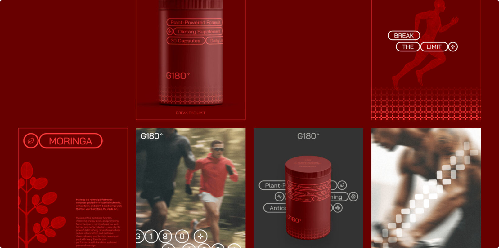
The Work, As It Happened
From a Basic Logo to a Complete Brand Universe
The project started with a simple brief: launch G180 as a new performance supplement in six weeks.
The work progressed through client alignment, concept development, brand expression and art development, before moving into product-focused content and launch resources.
The visual language evolved around the physicality of performance: runners in motion, low-angle perspectives, controlled blur, strong contrast, natural textures and a distinctly red-led environment. AI accelerated the exploration, while Photoshop brought consistency and human judgement to the final imagery.
The result was a launch-ready system that connected brand identity, product storytelling and performance content into one cohesive visual world.
One product. One visual language. One clear ambition: break the limit.
In Their Words
We'll Let the Results Do Most of the Talking
-
“Koncept rebuilt our entire online presence in under three months, and our online orders have nearly quadrupled since. They think like a partner, not a vendor.”
-
“What stood out was how few people we had to talk to get things done. One team, one point of contact, and the work still felt senior at every step.”
-
“We've worked with agencies twice their size that couldn't move this fast without breaking something. Koncept hasn't dropped a ball yet.”
-
“Their strategy work alone justified the engagement. The creative and performance marketing that followed just compounded it.”
-
“Time zones were never an issue. It genuinely felt like they were down the hall, even with a twelve-hour difference.”
Where Else We’ve Delivered