ELITE CONSTRUCTIONS
Building a Stronger Visual Foundation
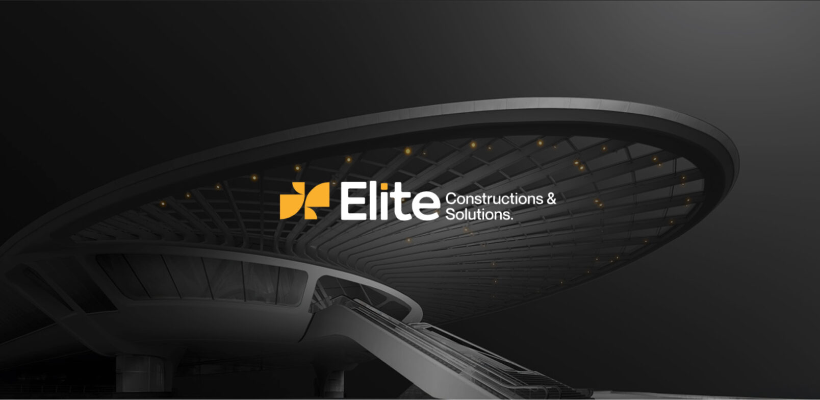
A brand identity direction for Elite Constructions & Solutions, built around architectural precision, structural confidence and a bold visual language. The identity combines a distinctive geometric mark with a strong typographic wordmark, supported by a restrained black, grey and yellow palette designed to feel modern, dependable and built for the construction industry.
Brand & Strategy · Creative & Production
The Challenge
Making the Brand Feel as Strong as the Work
For a construction company, credibility begins before a project begins. The visual identity needs to communicate confidence, precision and reliability while remaining distinctive enough to build recognition.
The challenge was to establish a brand direction for Elite Constructions & Solutions that could move beyond a conventional construction aesthetic and create a stronger, more contemporary identity.
- Establish a clear and recognisable visual identity
- Communicate strength and structural precision
- Create a professional identity suitable for the built environment
- Develop a system that could translate naturally from brand assets to physical environments
The Strategy
Structure, Precision, Presence
The direction takes visual cues from the built environment itself: architectural geometry, structural lines, engineered forms and strong contrasts.
Rather than relying on heavy construction clichés, the identity uses simple geometry and controlled proportions to create a more refined expression.
The system is anchored by three visual ideas:
The result is an identity designed to feel solid without feeling dated, and modern without losing credibility.
Execution
From Architectural References to a Complete Identity Direction
The work began with a visual exploration of architectural structures, construction environments and engineered forms, establishing the visual territory for the brand.
That direction was then translated into the core identity system.
-
Developed the brand mark
Explored a geometric symbol built from simplified forms, creating a visual cue that could work independently from the full wordmark.
-
Established the wordmark
Combined the symbol with a bold "Elite" wordmark and the supporting Constructions & Solutions descriptor to create a clear brand hierarchy.
-
Defined the colour direction
Developed a restrained palette built around black, grey and yellow, balancing authority with a distinctive accent.
-
Explored identity variations
Tested horizontal, stacked and emblem-style configurations to understand how the identity could adapt across different contexts.
-
Applied the system to physical environments
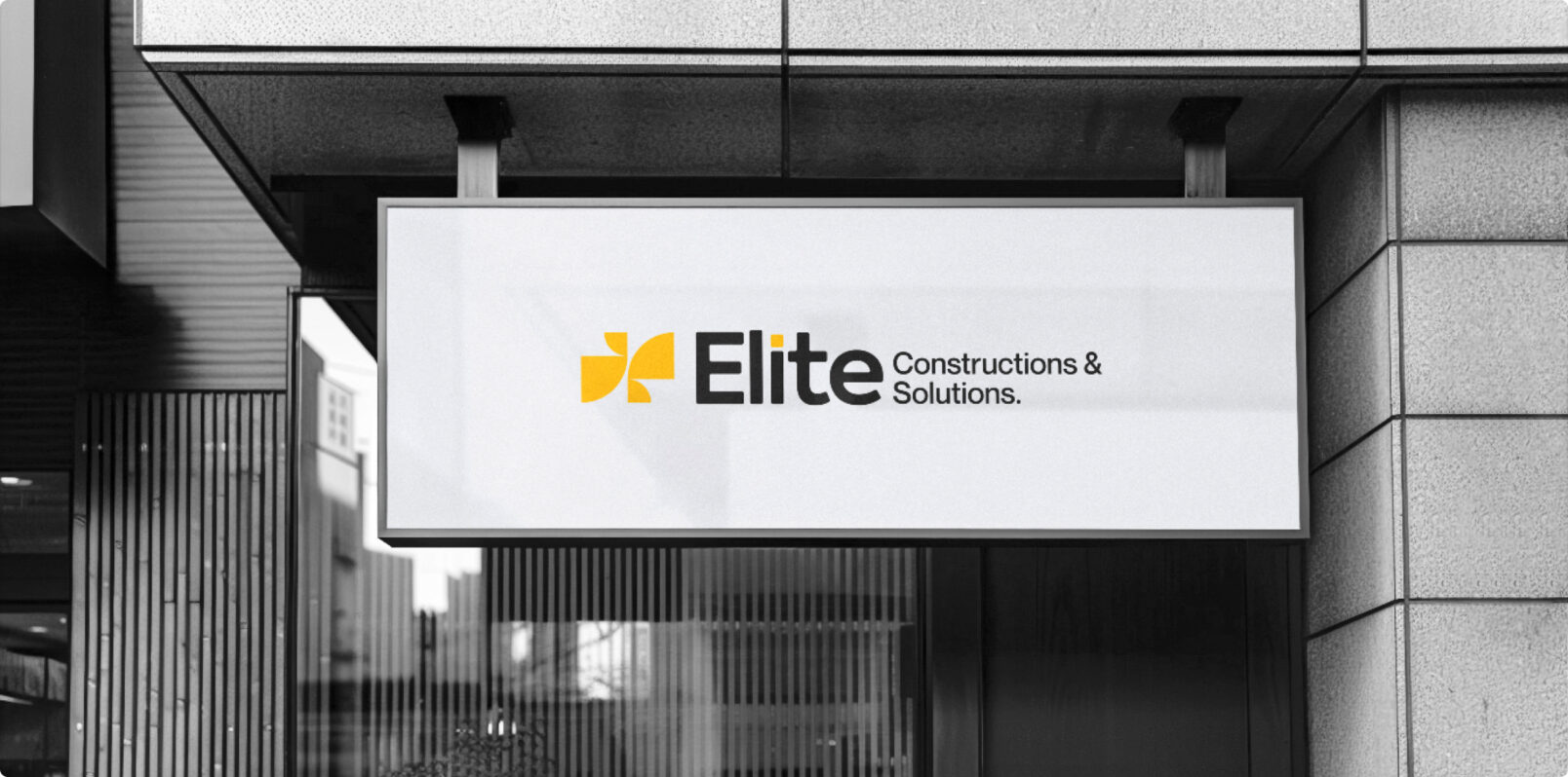
Visualised the identity across architectural surfaces, building signage and entrance signage, demonstrating how the system translates from the brand board into the built environment.
The Impact, Quantified
A Flexible Identity Built for the Real World
The available project material does not provide verified commercial or performance metrics, so the impact is best represented through the tangible identity system developed.
What the system enabled
| CORE IDENTITY | Mark + Wordmark |
|---|---|
| PRIMARY COLOURS | Black · Grey · Yellow |
| KEY APPLICATION TYPES | Brand · Building · Signage |
| FROM | TO |
| A construction-sector identity requiring a clearer visual direction | A structured brand system with a distinctive mark, strong wordmark and physical application language. |
The identity was designed to maintain recognition whether viewed on a brand asset, building façade or entrance sign.
The Work, As It Happened
From Architectural Inspiration to Brand Presence
The work started with the built environment itself. Architectural structures, geometric forms, construction imagery and engineered details established the visual territory for Elite.
Those references informed the development of the geometric brand mark, typography and black-grey-yellow colour system. Multiple identity configurations were then explored before taking the selected direction into environmental applications.
The final work demonstrates how a relatively simple identity system can gain considerable presence through scale, contrast, geometry and placement.
From the first architectural references to the final building signage, the idea remained consistent:
A construction brand should look built, not decorated.
In Their Words
We'll Let the Results Do Most of the Talking
-
“Koncept rebuilt our entire online presence in under three months, and our online orders have nearly quadrupled since. They think like a partner, not a vendor.”
-
“What stood out was how few people we had to talk to get things done. One team, one point of contact, and the work still felt senior at every step.”
-
“We've worked with agencies twice their size that couldn't move this fast without breaking something. Koncept hasn't dropped a ball yet.”
-
“Their strategy work alone justified the engagement. The creative and performance marketing that followed just compounded it.”
-
“Time zones were never an issue. It genuinely felt like they were down the hall, even with a twelve-hour difference.”
Where Else We’ve Delivered