DOLLHOUSE
Two Essentials. One Better Routine.
A two-in-one hair-care concept that brings shampoo and conditioner together in a compact, intuitive format, designed for dynamic lifestyles without compromising on comfort, function or visual appeal.
Product Design · Packaging · Brand Identity
The Challenge
Making Two Essentials Work as One
Hair care is often built around multiple products, multiple bottles and more complexity than an active lifestyle needs.
Duet was conceived as an innovative hair-care line that brings shampoo and conditioner together in one compact package, while still addressing different scalp and hair needs across normal, dry and oily types.
The challenge was to create packaging that could communicate this simplicity and innovation at first glance, while feeling practical, contemporary and relevant to an active, design-conscious audience.
- Combine two everyday hair-care products into one compact format
- Create a form that feels intuitive and comfortable to use
- Appeal to dynamic professionals with active lifestyles
- Balance functional simplicity with a distinctive emotional identity
The Strategy
Turning a Name Into a Story
The strategy began by looking beyond cosmetics and asking what “Dollhouse” could represent.
Research uncovered the historical idea of a dollhouse as a miniature world designed to display idealised interiors. That became a starting point for a broader narrative around innocence, care, emotion and beauty.
The creative exploration then focused on four connected ideas:
The resulting strategy was not simply to make Dollhouse look premium, but to make the identity carry a story of transformation from innocence to confidence.
Execution
From Story to Symbol to Shelf
The brand story was translated into a complete identity and packaging direction.
-
Built the visual concept
Research and brainstorming explored the emotional territory around women, innocence, care, love, natural beauty and the butterfly.
-
Created the symbolic mark
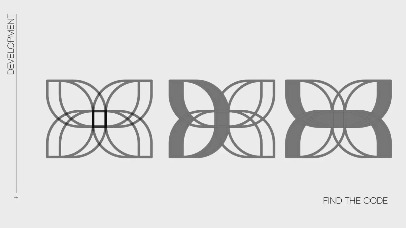
The final icon brings together a butterfly, a woman and the initials D & H, creating a mark whose meaning is embedded directly into its construction.
-
Established the identity
The symbolic mark was paired with a bold, architectural typeface to create a confident and sophisticated wordmark.
-
Developed the colour direction
Four distinct colour territories were explored: Bold Blue, Popping Pink, Charcoal Black and Luxury Golden, giving the brand flexibility across different expressions.
-
Designed the packaging language
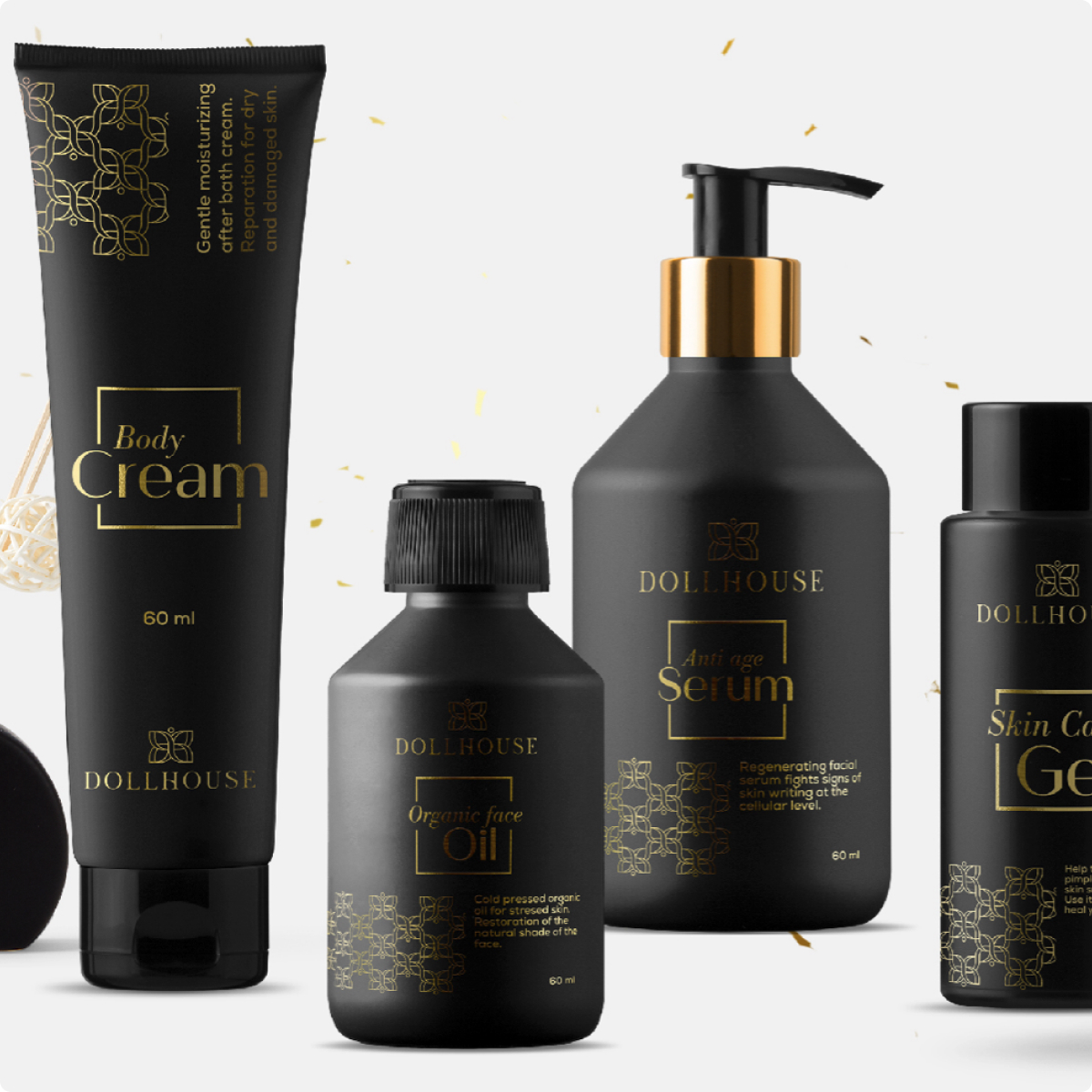
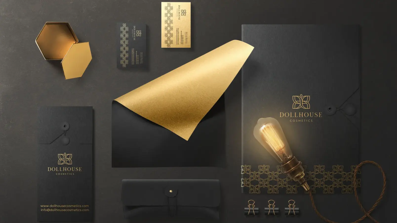
The identity was translated into a range of cosmetic packaging, using dark surfaces, refined typography, gold detailing and structured compositions to create a premium product presence.
-
Extended the brand into the physical world
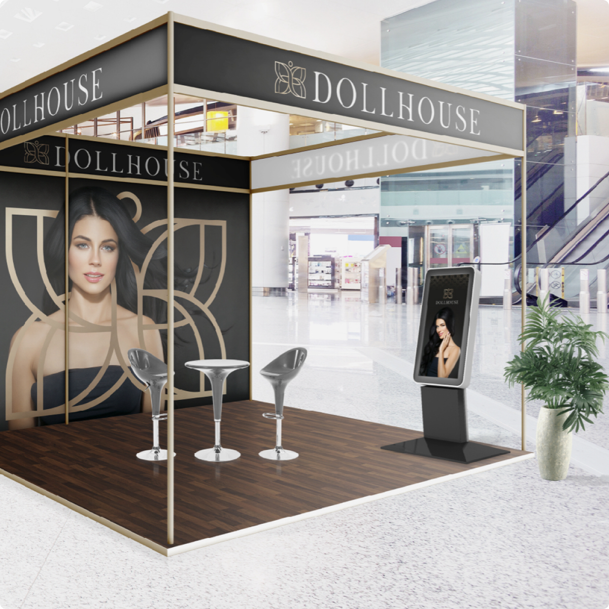
The system was visualised across promotional materials, retail displays, product environments and outdoor applications, demonstrating how the identity could scale beyond the pack.
The Impact, Quantified
A Story That Became a Complete Brand System
The project transformed one brand name and a simple initial direction into a structured visual identity with multiple layers of expression.
| 3 | 2 | 1 |
|---|---|---|
| CORE IDENTITY | COLOUR DIRECTIONS | KEY PHYSICAL CHANNELS |
| Symbol + Wordmark | Blue · Pink · Black · Gold | Packaging · Retail / Outdoor |
What the system delivered
The brand story was translated into a complete identity and packaging direction.
No commercial performance metrics are provided in the source, so the quantified impact is intentionally based on the actual design system and deliverable scope, rather than invented sales or awareness figures.
The Work, As It Happened
From Innocence to Confidence
The project began with a question: how could the name Dollhouse become more than a name?
Research into the brand and the heritage of dollhouses opened a path toward a story built around innocence, care, emotion and beauty. That exploration evolved through women, butterflies, hearts and the idea of transformation before converging on the final symbolic mark.
The butterfly became the expression of freedom. The woman became the centre of the identity. The D and H initials were woven into the form. Together, they created a mark that could communicate the story without relying on words.
From there, the identity expanded into typography, colour, packaging, retail displays and promotional environments.
Dollhouse became a visual story about becoming who you were always meant to be.
In Their Words
We'll Let the Results Do Most of the Talking
-
“Koncept rebuilt our entire online presence in under three months, and our online orders have nearly quadrupled since. They think like a partner, not a vendor.”
-
“What stood out was how few people we had to talk to get things done. One team, one point of contact, and the work still felt senior at every step.”
-
“We've worked with agencies twice their size that couldn't move this fast without breaking something. Koncept hasn't dropped a ball yet.”
-
“Their strategy work alone justified the engagement. The creative and performance marketing that followed just compounded it.”
-
“Time zones were never an issue. It genuinely felt like they were down the hall, even with a twelve-hour difference.”
Where Else We’ve Delivered